PayPal
Cash Card & Design System
Make everyday money movement feel safe before it feels fast.
- UX Designer
- 2015 – 2018
- Mobile · iOS / Android
- UX Design, Product, Engineering, Brand
- 10M+ PayPal customers
- Consumer · FinTech · Design System
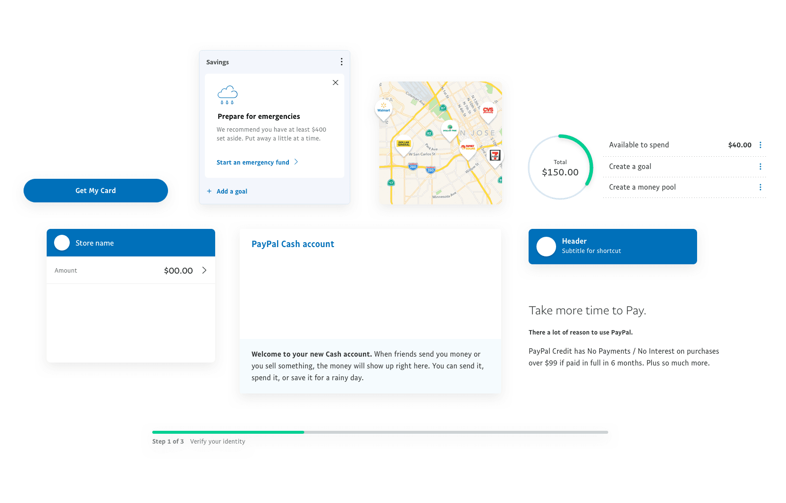
I designed Cash Card enrollment, cash management, and savings, and contributed to PayPal's design system.
Overview
The product had to earn trust from customers who expected fees, fine print, and rejection.
The Cash Card brought a physical financial product into a newly independent PayPal.
- 10M+
- 85%
- 100+
Core decision
Show the Terms Before the Action
Enrollment stayed short. Fees appeared before confirmation. Every cash movement showed the amount the customer would actually receive.
- Three clear enrollment steps
- Fees visible before commitment
- Limits and identity requirements in context
Design system
One Language After the Split
Post-eBay, products needed one recognizable PayPal language. I contributed to shared components, interaction patterns, and PayPal Sans.
- 100+ components with accessibility specs
- PayPal Sans optimized for digital products
- Shared patterns for onboarding, errors, and empty states
Impact
Scale That Mattered
The Cash Card reached 10M+ customers while enrollment completion held far above the industry benchmark.
- 10M+
- 85%
- 100+
- 4.7★
“The PayPal Cash Card is the easiest way to manage your money — period.”
Reflection
Key Learnings
Trust is the Product
Every screen had to answer: would I put my paycheck here?
Design Systems Need Governance
Consistency lasted when ownership was clear, not when the library was large.
Design for the Real Context
Money actions had to work one-handed, in motion, on a small screen.