SAVE
Investment News Platform
Three people. Four weeks. 100K daily users.
- E2E UX Design
- 2025
- Mobile · iOS / Android
- 2 Engineers, 1 PM, 1 Designer (me)
- 100K Daily Active Users
- Mobile · FinTech · Consumer
I owned mobile, desktop, onboarding, notifications, marketing, and launch design.
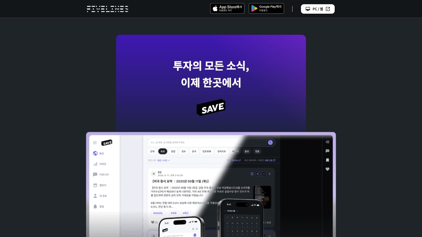
Overview
SAVE made speed legible: fast source delivery, aggressive filtering, and interfaces built for rapid scanning.
Korean investors were getting U.S. market news after the market had already reacted.
- 100K
- <30s
- 5.0★
Problem
The Feed Was Fast. Understanding Was Not.
Investors received thousands of headlines with little help deciding what mattered to their portfolio right now.
- 5–10 minute latency behind US sources
- Little portfolio or sector filtering
- Critical analysis remained locked in English
Core decision
Design for the Three-Second Scan
The desktop workspace keeps source, urgency, headline, market context, and live signals visible without opening every story.
- Priority and source are visible in the row
- Feed and market signals stay side by side
- Density serves monitoring, not decoration
Product system
Desktop Monitors. Mobile Moves.
Mobile keeps the same information model but changes the rhythm: quick feed, event planning, and personal settings designed for one hand.
- Feed cards preserve source and related ticker
- Calendar connects events to market context
- Navigation keeps five high-frequency surfaces within reach
Impact
Week 1: 1K → Week 4: 100K
With almost no paid marketing, fast delivery and clear scanning drove word of mouth.
- 1K→100K
- 5.0★
- <30s
- 80%
Reflection
Key Learnings
Speed is a Feeling
Thirty seconds versus five minutes changed how alive the product felt.
Small Teams Need Hard Priorities
Every surface had to earn a week of engineering time.
Launch Copy Sets the Product Contract
The site promised speed; the first session had to prove it.